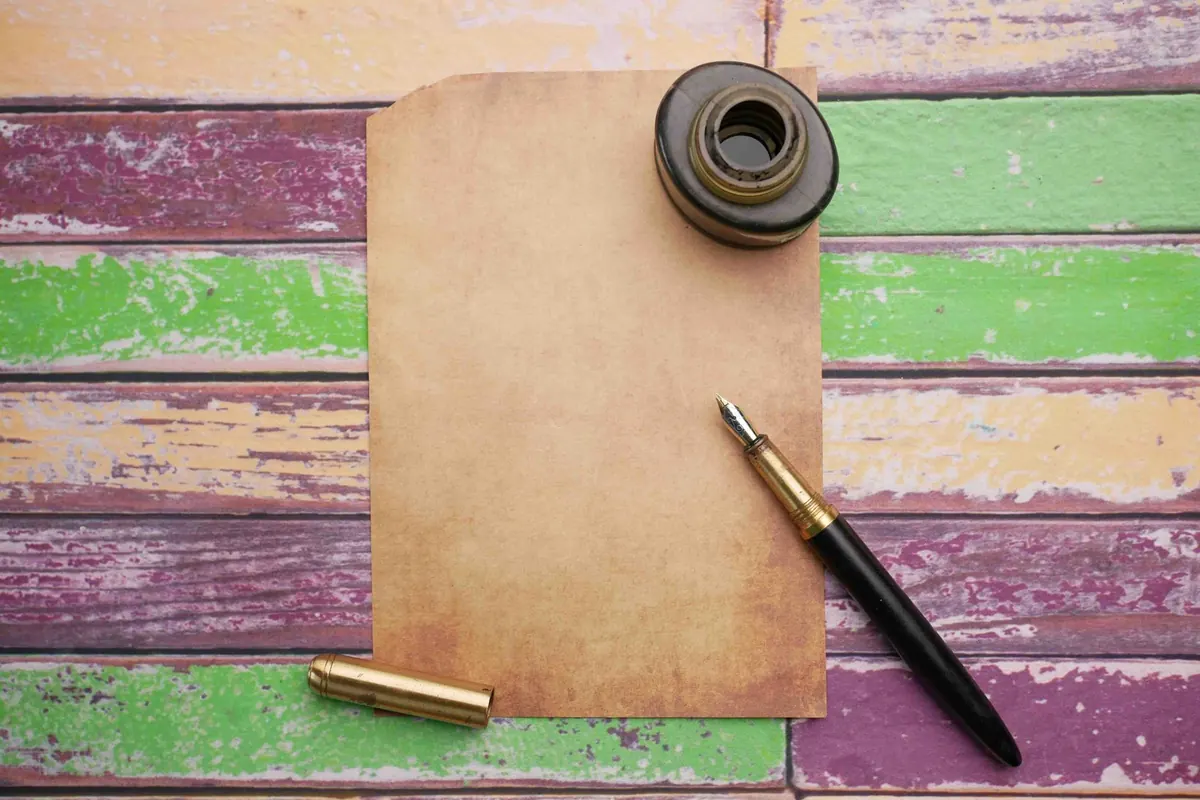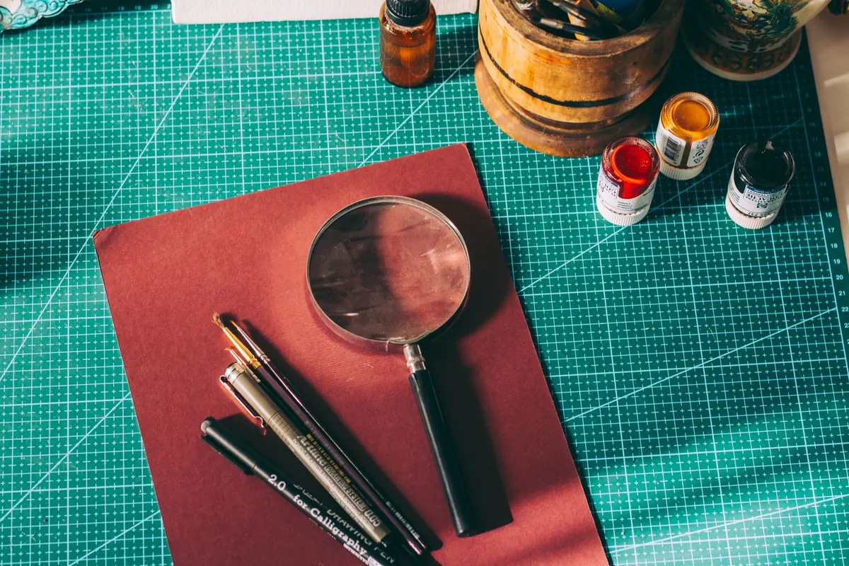
A bottle of ink is the most economical way to change how your handwriting looks. One small bottle will fill a converter dozens of times, and swapping colours takes a minute at the sink. The difficulty is that ink and paper are a partnership. The same blue that looks rich and elegant on smooth 90gsm paper can spread, feather and soak through a cheap pad before you have finished the line. Get the pairing roughly right and bottled ink becomes a pleasure rather than a smudge.
What actually matters in a bottle
Before colour, three things decide whether you will enjoy using an ink.
Flow. Some inks are wet and lay down a generous line; others are dry and sit closer to the nib. Wet inks feel luxurious on good paper and become a liability on thin paper. Dry inks — the Pelikan 4001 range is the classic example — behave far better on whatever the office printer uses.
Chemistry. Most bottled inks are dye-based: easy to flush, pleasant to write with, and generally not waterproof. Pigment inks, such as Platinum Carbon Black, are waterproof and lightfast but need more frequent flushing and should not be left to dry in a pen. Iron gall inks are permanent and traditional; they are acidic, so don't let them sit in an unused pen for months and don't use them in a pen you rarely touch. If you are unsure about a particular ink in a particular pen, ask the retailer or the manufacturer before filling.
Finish. Shading, sheen and shimmer all depend on paper as much as ink. Shimmer inks contain particles, need a broad wet nib and reward frequent use; leave them sitting for weeks and the particles settle in the feed.
The colours worth starting with
You need fewer colours than you think. A workable beginner's shelf looks like this:
- One reliable blue. Royal blue is the default for a reason: readable, photocopier-friendly and forgiving. Washable blues are easier to remove from clothing, which matters more than most beginners expect.
- One blue-black or black. Blue-black reads as formal without looking stark; black suits forms, signatures and anything that gets scanned.
- One colour you actually enjoy. A deep teal, burgundy, forest green or warm brown is still sober enough for meeting notes but makes a page of your own writing worth looking at.
In the UK, Diamine is a good place to start for range and small bottle sizes, alongside Parker Quink, Waterman, Lamy and Pilot. Buy a couple of sample vials before committing to a full bottle; specialist retailers sell them precisely so you can try before you invest. Avoid very pale inks (yellow, light orange) and heavy shimmer to begin with — the first is hard to read, the second is fussy about nibs and paper.
The paper you will actually meet
British paper falls into two rough camps, and knowing which one you are holding explains most ink disappointments.
Office and copier paper
Standard multi-function paper is usually 75–80gsm and uncoated. It is designed to take toner and inkjet droplets, not liquid ink, so it is absorbent. Wet inks feather along the fibres and bleed through to the reverse. Choose a fine or extra-fine nib, a drier ink, and accept that a little show-through is normal.
Notebooks
Oxford's Optik paper (used in Oxford and Black n' Red pads) is 90gsm and handles fountain pen ink well. Pukka Pad and Leuchtturm1917 are usually acceptable with a fine nib. Rhodia and Clairefontaine use smooth, coated 90gsm stock that shows off shading and sheen beautifully — but the ink sits on the surface, so drying takes longer. Moleskine varies between papers and batches; a few pages of testing will tell you what you have. Recycled pads are often more absorbent than you expect.
Matching ink to paper without guesswork
The rule of thumb is simple: wet ink, fine nib, good paper. If you are stuck with copier paper, go the other way — dry ink, fine nib, and write a little faster. A few inks are marketed specifically as feather-resistant for poor paper, and they are worth keeping in a work bag.
Test before you commit
Ten minutes of testing saves a bottle of ink you will never finish.
- Fill a converter rather than committing the whole bottle.
- Write the same sentence on every paper you use regularly: the office pad, your notebook, a greetings card, the back of an envelope.
- Time the dry-down. Wait ten seconds, then run your thumb across the line.
- Turn the page over and check for ghosting and bleed-through.
- Leave the sample overnight — some inks darken or shift colour once dry.
- Try it on the worst paper in the house. If it survives that, it will survive anything.
Left-handed writers should weight drying time higher than colour. A quick-drying blue is worth more than a gorgeous teal you smudge.
Filling, flushing and spills
Fill converters slowly, wipe the nib and section with kitchen towel, and never dip past the point where the section meets the barrel. Flush the pen with cool water every few fills — more often with pigment or iron gall inks — and dry it overnight before refilling. Store bottles upright, away from direct sunlight. Ink keeps for years, but if a bottle smells odd or has stringy sediment, don't put it in a pen.
For fresh spills, blot rather than rub and rinse with cold water; hot water sets many dye stains. Bear in mind that some saturated inks will permanently tint a clear demonstrator or a pale converter, even when the pen is clean.
A simple starter setup
Buy one blue or blue-black bottle for everyday use, one colour that makes you want to write, a fine-nibbed pen, and a notebook with 90gsm paper. Add a cheap pad of copier paper as your worst-case test sheet. Keep a page in the back of the notebook recording which ink you used on which paper, and how it behaved. Within a month you will know exactly what suits your handwriting, your desk and your budget — and you will stop guessing every time you fill up.
Photo: Sedanur Kunuk / Pexels